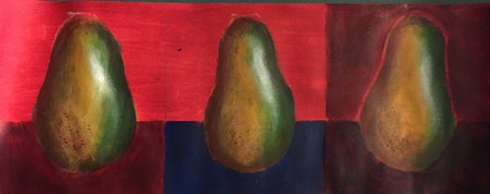
In this project, we painted pears using colors and specific uses of it to create the effect of shadows and depth. I have practiced with color depth in my own art before, but I enjoyed this project a great deal because it was an interesting experience to study the dimension of the pear with color contrast. I wish, in hindsight, that I had tried to gradient the greens with the yellows and browns more, because there is a clear separation between the three colors, and it somewhat erases that depth we were going for in the beginning. 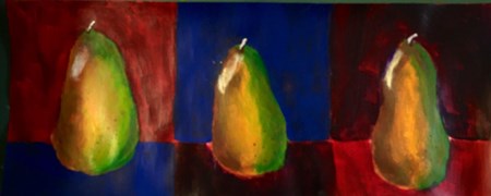
1 Comment
|
AuthorWrite something about yourself. No need to be fancy, just an overview. Archives
May 2016
Categories |
 RSS Feed
