|
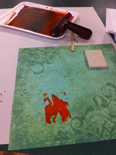
Here is another example of a project that I was really excited for in the beginning. When we began our practice project, I followed the original instructions, but after being unsatisfied with a few different attempts, I decided to change my approach toward the assignment. At this point, I was incredibly impressed with the way the lines seemed to form a crystalline shape. As a fan of fantasy work, and thus fantasy art, I have always had a particular affection for magical-looking pieces, especially with glowing lights. Fantasy art especially seems to have more saturated colors, making the world appear more lively and just colorful in general, which I have always admired. One of the greatest collections of art I’ve seen, actually, is the art done for cards from the game Magic the Gathering. The team of card makers has a wide collection of artists, although they’re all incredible. The universe of Magic is incredibly vast, allowing for many different types of art to be included in these beautiful cards.  (Amazingly enough, the artists who drew the art are credited right on the cards!) Art like this, especially those of Magic the Gathering Cards (as I was once a big player) is one of the reasons I love fantasy art like this, and helped me decide on a subject for my project here. The other big thing that influenced this piece was a show I have just begun watching called Steven Universe. Like any other child’s cartoon, the animation is simplistic, but the big part that was inspiring for me was the fact that the main characters are all based off different kinds of gems. In addition, the show itself is quite colorful, as the aforementioned fantasy art is as well. Now, it wasn’t really the show’s artstyle that inspired me, but rather just the focus on the color and the way they drew the gems. Having seen similar art of crystalline shapes, especially with bright colors like pinks and purples, it brought me back to a lot of pieces that I really loved. Crystals, because of the way the light shines off them and through them, are excellent representations of the theme of value, especially because of their geometric form. Which is exactly why I decided to stick with the crystal look for this piece, and include the bright colors and the various reflections. Art like this, done by Caterina Caligiuri, is just one of the many examples of art like this that represents this “value”. 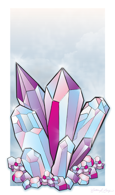 (As stated, this art was done by Caterina Caligiuri) Now, because I made the practice piece that I did also my final product, the medium I was using was already chosen for me. I also decided to use colored pencils for this project because when I have done value before I always seemed to be able to achieve the best transitions with colored pencils. I got right to work with a ruler and a pencil, making the lines for my crystal shapes so I could color them in later. After that process was complete, I started next on the subject that was being reflected in the crystals: an eye. The character that this eye belongs to has a long backstory, and one that I won’t detail here, but the crystal was the perfect setting for him, so I knew that that’s what I wanted to include. I did the coloring of the eye before the crystals, to get a look somewhat like this. 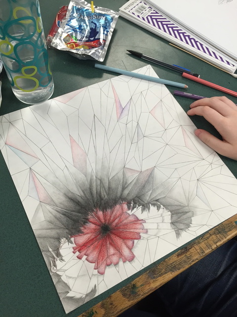 Next, I worked on the crystal colors, which ended up coming out a lot nicer than the eye, which by the end of the process I was actually disappointed with. If I have time, I may eventually attempt to go back and fix some of the issues I find with it. However, the colors I chose to fill in the crystals with were bright and fun, and I really loved the way they turned out, since they were almost exactly what I was hoping for. However, I would like to make the value transitions in the piece a bit more dramatic, and like with the eye, if I ever get the time I would like to go back and make some adjustments to the piece. However, overall I am happy with the way it turned out, although it did not exactly live up to my higher expectations. 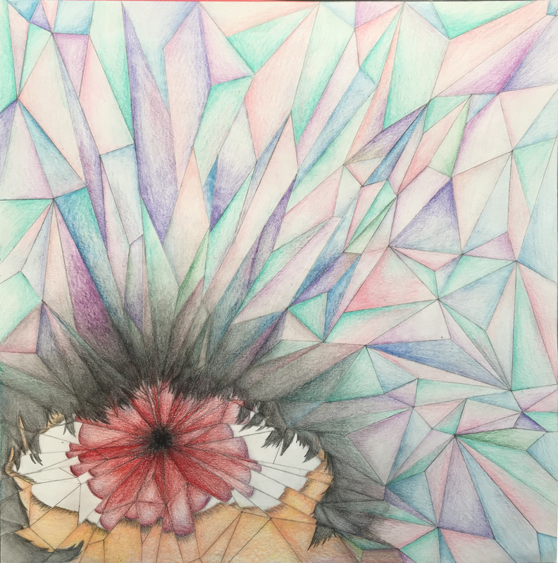
0 Comments
 (This is a hypothetical overview of our year in AP Art) Senior year was definitely a fantastic year! Just remembering everything gives me goosebumps, especially thinking about all the amazing things we did in school. The best part of it all, was that I received a 5 on my AP art portfolio! It certainly was a difficult task, let me say it now, and as much fun as it was it was such a draining process. You know how artists are, after all! Everything has to be perfect! The year started off simply enough. We started off with some simply activities, outlining techniques with the carving tools as well as simple shading techniques. I enjoyed the carving quite a lot, and made it a point to try different things with the ink I was using. After that the year moved into more of a self directed style, and though we were still learning new techniques, our projects became more expressive and self-evident. While still using the skills we were learning, I also wanted to connect my other pastime with my projects, that being my writing and character design. Our first project, that may have been quite simplistic for its instructions, I took it to another level and did something different, practicing with 2D lines to create a 3D looking space with a crystalline pattern. In the end it turned out quite well, and I included the reflection of an eye in the center of it, which was a reference to the backstory of one of my characters. By the time the next project rolled around, I was engrossed in my senior project, which was a character creation club. Being that a lot of my attention was focused on my characters at this point, I worked hard to include a lot of my characters into the projects I was working on. My characters are a big part of my character, and I feel like including them in my projects this year definitely helped me express a lot of my ideas. However, my focus still had to be on 2D design, and I turned to a more digital project, something I had practicing with lately on my own time. Testing with shading, color, and line weight, I created the bust of one of my characters, a piece which I am actually quite proud of. Here is the finished product below: I was very happy with the final result, and though it took a long time, it was exactly what I had pictured in my mind while creating the piece. The shading also was difficult, the skintones being a bit odd, and the hair was especially a hassle, because too large of a brush size wouldn’t capture the strands of hair while too small of a brush would lead to a strange striping pattern. However, I liked how it came out a very great deal. For our next project, I wanted to focus more on painting, and with that in mind chose a subject that I could picture easily in my mind. Inspired slightly by song lyrics, it was a tragic scene from one of my characters backstories (including my characters, again, got me more interested in the projects). This project, however, turned out to be very difficult. The end product was not exactly what I had in mind, and after all the hard work I put into it I was disappointed to see that it had no turned out the way I wanted. BUT, this has a happy ending. Towards the end of the project, I decided to go a different route, and adding a bit of watercolor to the acrylics I had already used, I achieved quite a nice effect on the background and sky. After the additions, I was very happy with the product, and was quite excited to show it off at our next critique. The year was winding down to a close and, while excited to end the year, I wanted to go out with a bang. My senior project, being the character creation club, had seen great success with its few attendants, and in my excitement I decided that I would draw a portrait of all the characters my club had worked on. It was A LOT of work. Bodies are always very difficult for me, and because of that I was constantly erasing and changing every little spot on the portrait. My friends were encouraging, however, and Tsvety especially helped me pinpoint some things that could be added in to add to the atmosphere: little jokes that had been made in the club, things that the members seeing the portrait would enjoy. While it was hard, however, I did get a lot of practice through the experience, and it was definitely a lot of fun seeing all my work from the year come together. I was excited to end the year on such a high note. In short, the 5 I received on my portfolio was well deserved, and I was so happy to see that all my hard work had paid off in the end. It was definitely worthwhile, knowing that I had tried very hard to focus on the 2D design issues listed in the AP guidelines. I focused especially on unity, knowing that a lot of my pieces had to stand alone as themselves without seeming too crowded. I also paid close attention to variety, and tried a lot of different methods of drawing and coloring with my various projects. Every project was an experiment with different materials, and even on some, like the painting, I took an important risk and it worked out great! This year I felt like I really expressed my voice, especially when using my characters, and was incredibly excited to see the end product of all my work. I think this year was amazing. 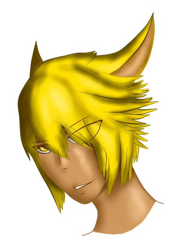 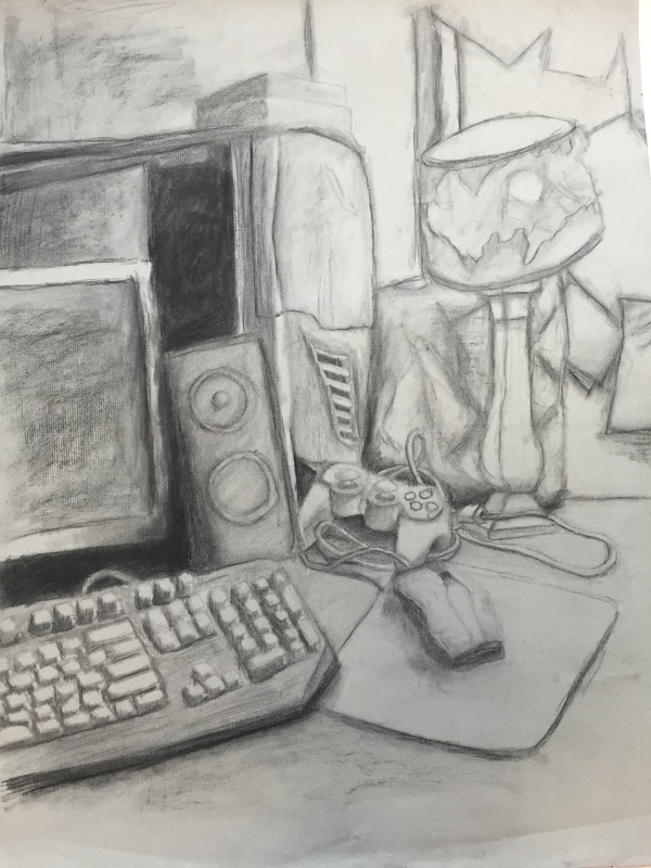 Summer is always a difficult time for work, even something as enjoyable to do as art. However, these two projects were very enjoyable for me, as they both touched upon subjects that I enjoyed. I first started with the still life. Knowing we would do this project since the beginning of the summer, I almost had in my mind exactly which area I would use as a reference. I planned exactly how I would set up the objects, as I wanted to make sure I had as much variety as possible on the textures while still maintaining what I wanted to represent. This project was especially fun for me because I felt that the final product really took a picture straight out of my life, with the way the items were arranged on the desk in their usual messy fashion, and how I use those items a lot in my own personal interests, as I enjoy gaming as well as playing a lot on the computer. This project gave me an opportunity to express things that I enjoy. The next project, the self portrait, was slightly more difficult for me, though I enjoyed it just as much. It was because I was unfamiliar with the technique, and even after reading the overview of the assignment in itslearning, I still didn’t quite understand how to do it. However, I followed the link that was attached to “chiarascuro”, a term that I had heard several times before though never really knew what it was, and after studying the images attached in that album I finally realized what the project was. It was very interesting to experiment with the idea of a reduction, as well, as this is something I had not done before. I tried a few different ways to begin, because I was unsure how to approach it, but after re-charcoaling the background finally I found my bearings and was able to get a good base. Taking the reference picture was also a lot of fun, because like the still life I wanted to be able to communicate something about me through the pose and the picture. Although it is difficult to tell in the piece, the image is actually of me in the light of my computer, which again, takes a piece of who I am and adds it to my art. This piece also proved to be slightly more difficult because of the subject of the human face. I typically draw in a cartoony style, meaning realistic pieces, especially faces, are not particularly my strong suit. However, I found that after studying the reference picture I had taken very heavily, I was able to get at least a few of the features to come out looking alright, and I feel like I improved slightly in my realism in the process (which also allows me to give a little bit more definition to my cartoony style). Though the face may seem a bit warped and awkward, I am proud of the product, as I feel I was definitely able to improve on my realistic art. 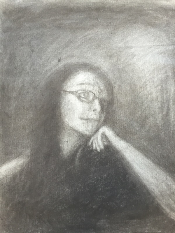 |
AuthorWrite something about yourself. No need to be fancy, just an overview. Archives
May 2016
Categories |
 RSS Feed
