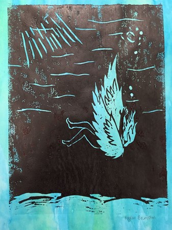
 I was unfortunately more unimpressed with the product of this project than any other. I do like the way the carving came out, but it was difficult to get the right color I was aiming for when I painted the block to print. I do, however, like the black and white prints (as well as the one with the colored background above), and I think the tool which I used to transfer the inks (a paintbrush with the colored ink, and a roller with the black) really made a difference in how the print came out and what the product appeared to be. The original design for the carving spawned from a desire to do something delicate that would highlight color and contrast. However, the carving was difficult to do, and it didn't come out as well as I'd hoped. In some of my later prints, the space inside the wings got color, although it was not originally intended to be filled it. I realized that I should have carved the space there deeper, but did not. 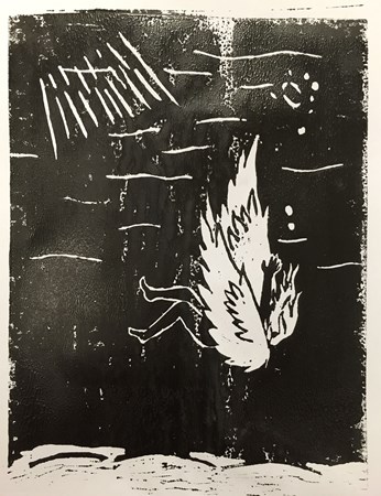
0 Comments
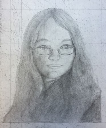 In this project, we started with a grid and, using a picture of ourselves, drew a self-portrait. I had a particular issue with my hair when drawing the picture on paper, but the grid especially helped with the shape and contours of the face. I have always had an issue with redrawing and translating space between two different mediums, which is evident in the way I drew the eyes lopsided. However, I also decided that I did not want to erase the gridlines, because it provided a nice background, and the image I had drawn stood out well enough against it. 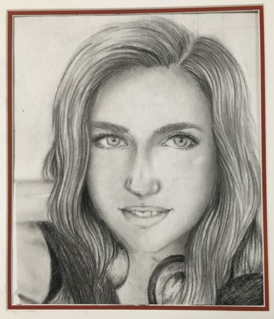 |
AuthorWrite something about yourself. No need to be fancy, just an overview. Archives
May 2016
Categories |
 RSS Feed
