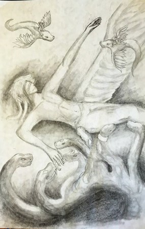
 For this piece we focused on emulating an artist of our choice from history. They could be from any genre, and the benefit to this was that we had a wide variety of art, both modern and not, that was reflected in the work we did. I personally did Goya, a Spanish artist who was famous for his etchings as well as his royal portraits which he painted during his time with the royal family. He lived a long life, and created many pieces of art throughout it. His time living through the Spanish war also produced art, a series called the Disasters of War which is exactly as the name suggests. Additionally, he later when deaf in his late life, and began painting a series called the Black Paintings, which creepily enough were painted on the walls of his house in a surprisingly horrifying amount of detail. Goya was an incredible man, and his ability stretched across several different kinds of art. It was interesting to study the man's life and a humbling thing to attempt to emulate his work.
0 Comments
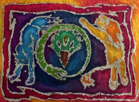
In this project we used wax to draw a picture on a piece of cloth, which we then used dye to dye. At first I found the wax to be very unruly, and difficult to work with, as I had an image in my head of what I wanted. However, I actually liked the way it came out in the end, although the off center images do annoy me and if I had the chance I would go back and make the snake more towards the middle of the two mammals. I think, however, the colors came out nicely and despite the deep contrast it looks nice over all. 
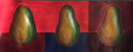
In this project, we painted pears using colors and specific uses of it to create the effect of shadows and depth. I have practiced with color depth in my own art before, but I enjoyed this project a great deal because it was an interesting experience to study the dimension of the pear with color contrast. I wish, in hindsight, that I had tried to gradient the greens with the yellows and browns more, because there is a clear separation between the three colors, and it somewhat erases that depth we were going for in the beginning. 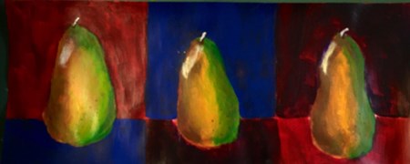
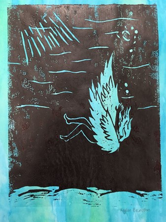 I was unfortunately more unimpressed with the product of this project than any other. I do like the way the carving came out, but it was difficult to get the right color I was aiming for when I painted the block to print. I do, however, like the black and white prints (as well as the one with the colored background above), and I think the tool which I used to transfer the inks (a paintbrush with the colored ink, and a roller with the black) really made a difference in how the print came out and what the product appeared to be. The original design for the carving spawned from a desire to do something delicate that would highlight color and contrast. However, the carving was difficult to do, and it didn't come out as well as I'd hoped. In some of my later prints, the space inside the wings got color, although it was not originally intended to be filled it. I realized that I should have carved the space there deeper, but did not. 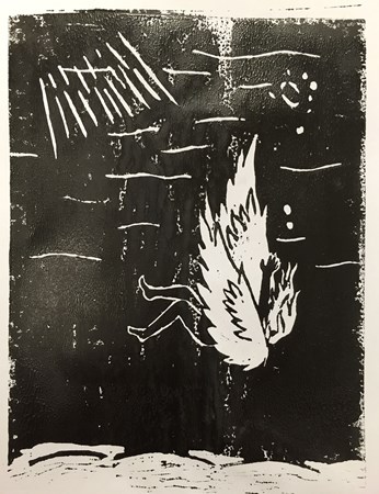 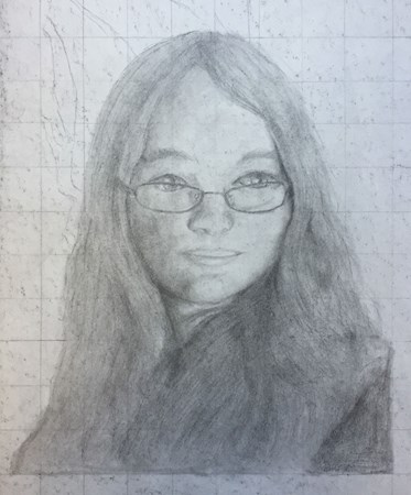 In this project, we started with a grid and, using a picture of ourselves, drew a self-portrait. I had a particular issue with my hair when drawing the picture on paper, but the grid especially helped with the shape and contours of the face. I have always had an issue with redrawing and translating space between two different mediums, which is evident in the way I drew the eyes lopsided. However, I also decided that I did not want to erase the gridlines, because it provided a nice background, and the image I had drawn stood out well enough against it. 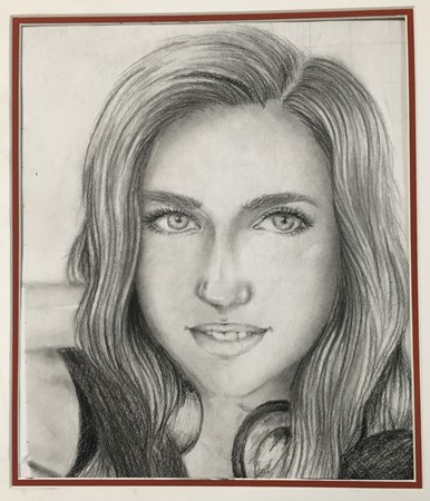 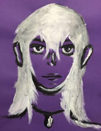
Having never studied facial proportions directly before, but being a person that draws faces a great deal, it was strange on the first draft of this seeing how the face came out. However, the second time around I had a lot better time with it, and I'm much happier with the finished project.
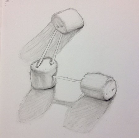
Here we used marshmallows as a subject for a value study, to observe the effect of shadows and light. I enjoyed this, and because we were encouraged to use different shades between the scale of dark and light, so it was interesting to see that effect.
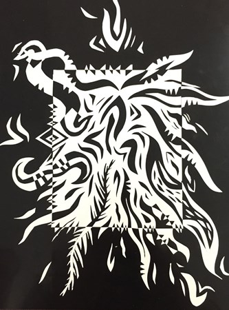
In this project we utilized a special type of paper that allowed us to explore the relationship between dark and light, and the contrasting positive and negative space. We were able to carve out of the white and then place it in the black, creating the interesting contrasting effect seen here. I enjoyed this project a lot, and it made me appreciate the difference in color far more.
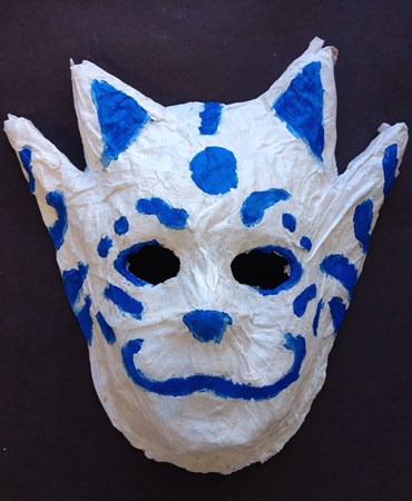
I think these past weeks have been very productive for me. I am someone who usually just sketches in pencil on plain printer paper, so in this class I have done a lot of things that I've never tried before. It was a lot of fun, and I look forward to trying different techniques. I've been able to express a lot in my work by being a little out of the box, such as the ears on my mask. I've been able to be a little spontaneous as well, as I'm often very uniform in the sort of things I draw or paint. This class has allowed me to just go crazy with the sort of things I do, and it's been a learning experience. 
This project was admittedly my favorite of the entire year, but in the end I really couldn't visualize what I wanted it to turn out like, and I began with something far different than I ended with. I had the issue of completing the painting part of the mask, but I really didn't like the way it turned out. To solve this problem, I painted it over white again, and then did a much simpler paint job. I am much happier with it this time around, and I feel like, with just a little bit of work, it could look very nice. In terms of developing techniques, I have never used paper mache before, so this was my first time. It was a strange experience, but I had fun using it. I hope that I'll be able to work on my skills with it, because the ears of my mask had some open parts that I would've liked to closed. 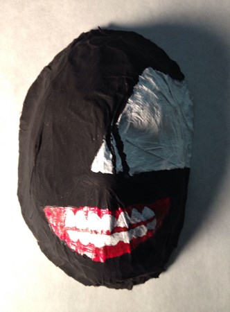
|
AuthorWrite something about yourself. No need to be fancy, just an overview. Archives
May 2016
Categories |
 RSS Feed
