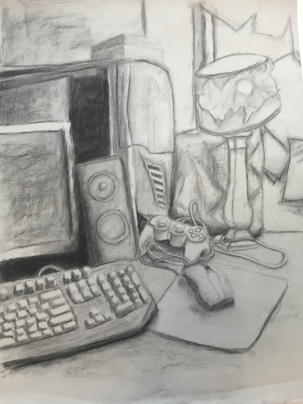
 Summer is always a difficult time for work, even something as enjoyable to do as art. However, these two projects were very enjoyable for me, as they both touched upon subjects that I enjoyed. I first started with the still life. Knowing we would do this project since the beginning of the summer, I almost had in my mind exactly which area I would use as a reference. I planned exactly how I would set up the objects, as I wanted to make sure I had as much variety as possible on the textures while still maintaining what I wanted to represent. This project was especially fun for me because I felt that the final product really took a picture straight out of my life, with the way the items were arranged on the desk in their usual messy fashion, and how I use those items a lot in my own personal interests, as I enjoy gaming as well as playing a lot on the computer. This project gave me an opportunity to express things that I enjoy. The next project, the self portrait, was slightly more difficult for me, though I enjoyed it just as much. It was because I was unfamiliar with the technique, and even after reading the overview of the assignment in itslearning, I still didn’t quite understand how to do it. However, I followed the link that was attached to “chiarascuro”, a term that I had heard several times before though never really knew what it was, and after studying the images attached in that album I finally realized what the project was. It was very interesting to experiment with the idea of a reduction, as well, as this is something I had not done before. I tried a few different ways to begin, because I was unsure how to approach it, but after re-charcoaling the background finally I found my bearings and was able to get a good base. Taking the reference picture was also a lot of fun, because like the still life I wanted to be able to communicate something about me through the pose and the picture. Although it is difficult to tell in the piece, the image is actually of me in the light of my computer, which again, takes a piece of who I am and adds it to my art. This piece also proved to be slightly more difficult because of the subject of the human face. I typically draw in a cartoony style, meaning realistic pieces, especially faces, are not particularly my strong suit. However, I found that after studying the reference picture I had taken very heavily, I was able to get at least a few of the features to come out looking alright, and I feel like I improved slightly in my realism in the process (which also allows me to give a little bit more definition to my cartoony style). Though the face may seem a bit warped and awkward, I am proud of the product, as I feel I was definitely able to improve on my realistic art. 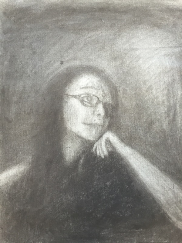
0 Comments
Leave a Reply. |
AuthorWrite something about yourself. No need to be fancy, just an overview. Archives
May 2016
Categories |
 RSS Feed
